Portfolio
Design should never say, “Look at me.” It should always say, “Look at this.” — David Craib
At Digital Dementia, we always strive to produce products that live up to the above quote. We collaborate with some of the most talented individuals in the area to ensure that your website is one of a kind. Our portfolio represents just a small sample of the work we have produced for our clients.
Caledonia Ramblers
The Caledonia Ramblers wanted to refresh their website with the latest web technologies and make it mobile friendly. The goal was to enhance the website as the go to resource for local outdoor recreationalists who enjoy hiking and snowshoeing.
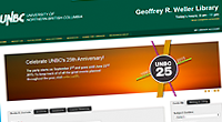
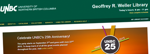
UNBC Library
The University of Northern British Columbia's Geoffrey R. Weller Library needed refresh its website to make it more dynamic, mobile friendly and highlight the services that it offers.
Northern BC Community Sport Development Society
Northern BC Community Sport is a new organization that focuses on actively promoting sports as a sustainable way of building strong communities throughout northern British Columbia. They needed a new website that promoted their ideals and help reach the communities they serve .
Entertainment Group
One of the top DJ companies in Northern BC, Entertainment Group wanted to transform their old website into a vibrant and dynamic website that reflected their fun business and improved efficienices.
Weddings & Proms
An innovative entrepreneur in Vanderhoof BC wanted to create a website that focused on selling previously loved gowns, wedding dresses and formal wear to clientele in northern BC.
Chickenbus Tales
Local Prince George author Vivien Lougheed wanted a new website to blog and share photos from the travels and adventures that she and her husband John experience together. She also wanted a site that would be easy for them to maintain at home and on the road.
PacificSport Northern BC
Provide a fresh new look that reflects the organization's existing promotional materials and improve usability for their clients. The site had to be easy for staff to maintain and provide reporting capabilities to effortlessly keep track of event participants, their special needs and the fees collected.
Pacific Environmental Industries
Created an informative and professional looking website for a new local business. They wanted a website that reflected their values and would set them apart from their competitors.
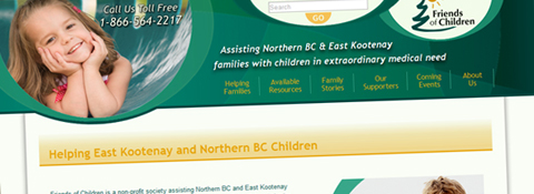
Friends Of Children
Parents of sick children need to find information quickly, so this website was redesigned to make finding that information quickly and easily using large, app like buttons located throughout the site. The design itself uses curves and swirls to make the site more inviting and more closely reflect their promotional materials.
Ohh…Chocolat Café
Design a new website to that highlights all the scrumptious treats, specialty coffees and menu items that Ohh… Chocolat Cafe offers. The emphasis was use a lot of pictures with apt descriptions to entice visitors to visit one of their locations.
- 1 of 2
- ››


